I know, I know, gag you with a spoon, right?
Needless to say, though, our wedding colors would also fit with us. I know there are a lot of really pretty color themes that are 'in' right now:
 |
| image via TheKnot | Really bright, popping colors |
 |
| image via Bridal Canvas | the awesome peacock trend |
 |
| image via TheKnot | Soft, pretty hues |
As is typical of my life and attitude, I didn't know - or care - about 'trends' when I thought about our wedding colors. For as long as I can remember, I've known (after discussing with Mr. Palm Tree, of course) that Our Colors would be sapphire and aquamarine after our birthstones. Say it with me now: vommmmm awwwwwwwwwww.
Until I got heavy into wedding planning, I didn't really think about splashes of color. I sincerely thought we'd just alternate the shades of blue: bridal party in 'aquamarine', groomsmen in 'sapphire'; flowers the opposite of whichever color; napkins in both. You get the picture. No? Let me show you:
 |
| source |
As much as I love the above two colors together, the first thing I think of is: snow. The second: cold. Get where I'm going with this? Considering we're getting married in May, and I sincerely despise anything even remotely winter-related, this is not the look I wanted.
I mixed in some color and was much happier with the results:
 |
| source | Some of these images are really bizarre, aren't they? Sheesh. |
 |
| source |
The first one had a percentage of purple, the second had a percentage of pink. Both had hints of yellow and green. I like the overall look of the second one more, I think because the purple and the blues mixed too much.
After I discussed the added splashes of color with Mr. PT, who surprisingly wholeheartedly agreed upon their necessity, I set to work finding inspiration pics featuring these colors. My main idea is to have the beautiful Pad and Pie decked out in multi-colored somethingorother, but I'm still toying.
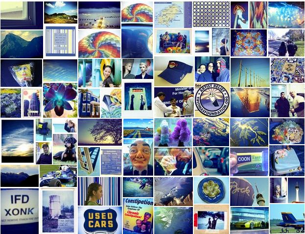
 |
| MSPaint Creation by yours truly, sources as follows, from top left to right: One; Two; Three; Four; Five; Six; Seven; Eight and Nine. |
With the help of Pinterest, I was able to create (a term I use loosely, mind you, considering it was a quick MSPaint mashup) what I am referring to as an Idea Board. Any time I see any - or all - of the colors I have in mind, either as 'main' or 'complementary', I quickly save it. None of them are THE Vision, but I think the one that truly embodies what we're going for is Image Eight of the bouquet against the yellow: although the shades are a bit off, it does capture the overall idea. I'd like to add another color in there (pink, silver, light purple) to break up the blues/greens, or maybe if there was more yellow in the actual bouquet and it rested on a silver background I'd be more pleased. Still, it's nice to have a starting point and again, one of the best things about starting the planning process so early is that I still have time to play before I/we decide.
How did you pick your colors? Do you have any color suggestions for me or others in 'play' mode? :)
I'm not gonna lie, the first paragraph made me tear up a bit. Damn, we love you guys!
ReplyDeleteLOVE 'Pad and Pie's Mom'. Love you guys more.
DeleteI can totally see the girls in colorful little tutus!
ReplyDeleteI showed you them before, didn't I? Our (P&P's Mom and myself) Fbook messaging consists solely of OMG'ing over petticoat skirts and tutus over the past few months.
DeleteI definitely dig the classic combination of a gorgeous blue and a happy, sunny warm gold yellow! It will compliment your blues and greens well and then a pop of pink is not only *adorable*, its feminine and fun! Plus, you posted a pic of yourself ina hot pink dress a few posts back, and honestly, you wear that color better than anyone I have ever seen. And I have watched all the episodes of project runway.
ReplyDelete